Learning statistics is unavoidable for researchers. Aside from a few last refuges like literary theory, philosophy, or ethnography, understanding the world by analysing quantitative data reigns king in nearly all fields. If a psychologist wants to know whether power posing makes people behave more confidently, he conducts experiments and uses statistics to judge whether his hypotheses were supported. If a social scientist wants to understand motivations of Trump vs Clinton voters, statistics tell her how many people to survey, and afterwards whether the voters are different.
For most people, however, statistics is hard, and many find the mere idea of learning it terrifying. I remember taking a statistics course in which the lecturer after each class would project a huge image of cute puppies onto the screen, to calm down the frustrated humanities students in the room…
Even among established academic researchers, the level of statistical literacy is often not what it ought to be. One researcher used a computer program to recalculate critical statistical tests in 250,000 articles published in major psychology journals, and found that one in eight had at least one grossly inconsistent p-value that may have invalidated the article’s statistical conclusions. A recent review of papers published in top-journals (e.g. Science) found that 15% used incorrect statistical procedures, and another review drily remarked that it’s “easier to get a paper published if one uses erroneous statistical analysis than if one uses no statistical analysis at all”.
What to do?
So what do we do about the fact that statistical literacy is exceedingly important, yet people find stats difficult and scary to learn and even senior researchers make blatant mistakes? One approach is to make statistics more fun to learn by using sexy and eye-grabbing data sets in statistics classes. For example, Andy Field’s popular series of textbooks Discovering Statistics carry the subtitle “… and Sex and Drugs and Rock ’n’Roll” and has their reader learn statistics by analysing things like (lack of) personal hygiene at festivals, the effect of using Coke as a contraceptive, and the relationship between being off-one’s-face drunk and getting into physical fights (!).
Such a ‘sugar coating’ approach, however, only takes us so far. A more radical approach is to reconsider the statistical vocabulary we use in the first place.
The purpose of a scientific vocabulary, I would argue, is to (a) give concrete form to useful concepts (b) in a way that’s concise and puts minimal strain on our working memory, and which (c) is quick and easy to learn and remember. How are we doing in statistics, relative to this target? Do we use terms that make our concepts clear, transparent, and easy to memorise? Or (you can probably tell where I’m going with this…) have we created a wasteland of arbitrary symbols and names of statistical inventors that both makes terms difficult to remember and obscures their internal relationships? I think the latter is true to a disturbing degree.
The problem with statistics - Example 1: the chi-squared test
Imagine I want to know if there’s a relationship between how often people go fishing and how often they eat fish. I might go and ask 1,701 random people two questions: How often do you go fishing? and How often do you eat fish? Let’s say I get these results:
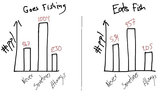
Hypothetical distribution of responses when asking 1,701 random people the questions ‘How often do you go fishing?’ and ‘How often do you eat fish?’.
These are the distributions of people answering ’Never’, ‘Sometimes’, and ‘Always’ to my two questions (‘Always’ means that you just can’t ever stop yourselves fishing, or, that you just can’t stop putting fish in your mouth because it’s too delicious). I ask each person both questions, so each person has one score in one distribution and one in the other, and it’s the relationship between the two that we are interested in. We can show the data in another way to get the combinations of answers:
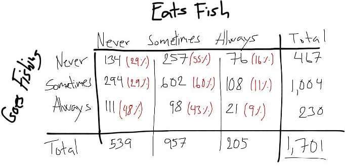
There seems to be a relationship - among people that “Always” go fishing, 48% never eats fish, whereas among people that “Never” go fishing, only 29% never eats fish. We seem to have a negative relationship, where people who go fishing more often are less likely to eat fish. But maybe this relation is just coincidence. How might I test that? One way is to think about what proportion of responses of ‘Never’, ‘Sometimes’ and ‘Always’ I’d expect on ‘Eats fish’ if it actually doesn’t matter whether people go fishing. In this case, no matter what people answer on ‘Goes fishing’ I should see the same distribution of answers to ‘Eats fish’, as I do overall. Like this:
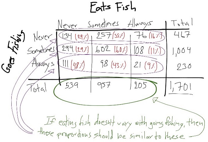
In other words, I can find out what proportions of eating fish I expect to see if it doesn’t change with how often one goes fishing. Then I check how different the proportions I actually observe are from what I expected. Finally, I can find out how likely it is that I get this difference just by chance, if there isn’t actually a real difference - and this is my “p-value”.
Now, what might be a sensible name for such a test? It’s kind of a Proportions_Observed-vs-Proportions_Expected test. Maybe it’s called a POPE-test? And maybe there’s a subscript that disambiguate it from similar tests that use the same idea, while making it obvious that the tests share a relationship? Well, the convention statisticians settled on is to call it a “chi-squared”-test. You know, just to make things obvious.
The problem with statistics - Example 2: chi-square’s measures of association
Okay, let’s return to our example. Let’s say that my POPE, apologies, my chi-squared test tells me it is super unlikely to see a difference between expected and observed proportions this large by chance. In the jargon, my result is “statistically significant”.
“Statistically significant”, however, doesn’t mean “this effect is big and important”. It just means “I am unlikely to observe this data by chance if there’s no actual relationship between my variables”. It doesn’t tell me anything about the size of the relationship. (We should all pledge to stop calling effects “significant” and instead say e.g. “detectable”, so we don’t in the minds of our readers - or ourselves - conflate the existence of a relationship with its magnitude or importance. A ‘statistically significant effect’ only means that it’s ‘statistically detectable’. Moving on.) So what do I do if I want to know how strong the association is?
Here’s one approach: Say I find that how often people eat fish varies depending on how often they go fishing. When we look at the data it seems that there is a negative relationship, where people less frequently eat fish the more often they go fishing. (Maybe people who fish more also eat less fish because they acquire greater empathy with fish, after seeing them repeatedly trying to escape from the hook…) How do I put an objective number on how strong the relationship is?
I might start by counting the number of times where a participant who scores higher than other participants on ‘goes fishing’ also scores higher than others on ‘eats fish’. Statisticians call this “concordant pairs”:
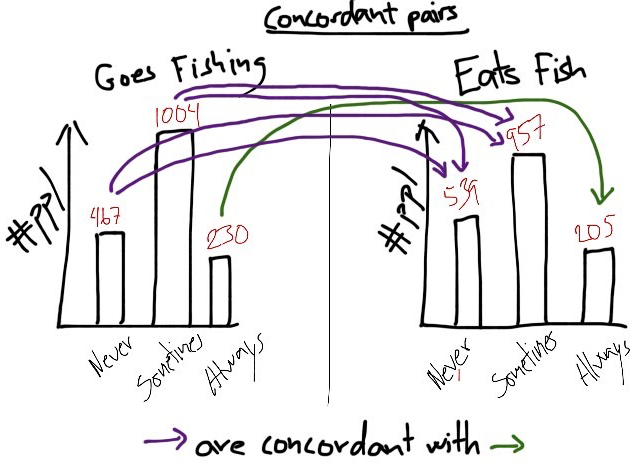
In my drawing, some people say they ‘always’ goes fishing, and also say that they ‘always’ eat fish. The participants who score lower than ‘always’ on goes fishing and also lower than ‘always’ on eats fish, form ‘concordant’ pairs with the always-always people.
Next I count the number of times where the opposite happens. That is, the times where a participant who scores higher than other participants on ‘goes fishing’ scores lower on ‘eats fish’ than the others. Statisticians call this “discordant pairs”:
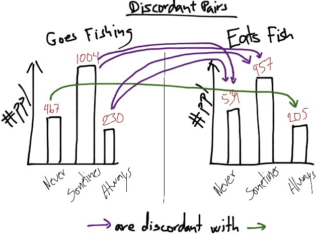
In my drawing, some people say they ‘never’ goes fishing, and also that they ‘always’ eat fish. People who score higher than ‘never’ on goes fishing but lower than ‘always’ on eats fish, form ‘discordant’ pairs with the never-always people.
Now, if I’ve got a strong negative relationship where people who more often goes fishing almost always eat less fish than those who less often goes fishing, then there will be many more discordant pairs than concordant pairs. So one simple measure of effect size is the difference between concordant pairs and discordant pairs, compared to the total number of those pairs.
What might such a test be called? It’s a kind of Concordant-vs-Discordant-Pairs Test. Maybe it’s called a Concordance-Difference-Test, or ConDif for short? Again, clever people might come up with lots of variations on this kind of test, so maybe there’s a good name for this general approach, like ConDif, and then various subscripts that disambiguate related tests from one another, while making it obvious that they take the same kind of approach?
Well, statisticians’ name for this test is ‘Goodman-Kruskal’s gamma test’, or just ‘gamma test’. Okay, okay. But have they at least been consistent and named the test variations that use the difference between concordant and discordant pairs something with ‘gamma’? Not quite. Some of the popular variations on the approach are called “Yule’s Q”, “Somer’s d”, and “Kendall’s tau” (Kendall’s tau in turn has versions a, b, and c).
How to do statistics better
I could go on, but this should be enough to illustrate the point. For students who struggle with learning statistics, or for researchers who aren’t themselves statisticians, our obscure vocabulary makes understanding and remembering the concepts unnecessarily difficult. It increases the number of terms to learn (with the consequence that many give up in frustration or just can’t be bothered) and puts a smokescreen over the relationship between tests.
If we accept that statistics is both a) super important and b) super difficult for many people, then we need to think hard about the best ways to teach and communicate it. We might try to sugar coat our current terms to students. However, sugar coating only takes us so far when our vocabulary is arcane and obscure in the first place. In some cases we do have okay terminology or have made an effort to improve the ones we had. For example, the term ‘ANOVA’ is alright - it’s short for ‘ANalysis Of Variance’ and gives a hint that it works on a principle of comparing variance between groups. Similarly, the simple term ‘bell-curve’, used in place of the obscure ‘Gaussian distribution’, substitutes veneration of a statistics guru with a term that gives an immediate reminder of what it points to.
Reforming our statistics vocabulary is a low-hanging fruit that should make statistics quicker to learn, more transparent to understand, and easier to use. As we move into the era of big data, where a basic level of statistical literacy is essential, it’s about time to get started.
| Current term | Better term |
|---|---|
| chi-squared test | POPE (w/ chi-squared as subscript) |
| statistically significant | statistically detectable? |
| Kruskal-Goodman’s gamma | ConDif |
| Yule’s Q | ConDif (it’s just gamma for a 2x2 table) |
| Somer’s d | ConDif (w/ Somer’s d as subscript) |
| Kendall’s tau | ConDif (w/ Kendall’s tau as subscript) |
| t-test | StdMeanDif (w/ Student’s t as subscript) |
| F-ratio | … |
| … | … |
Comments
I use the open source, zero-tracking utteranc.es widget for comments - it's built on GitHub issues, so you need a GitHub account to comment.